Print
PrintJames D. Evans and Robert A. Freedman are partners at Fenwick & West LLP. This post is based on their Fenwick memorandum.
As we had predicted in our prior IPO survey, 2019 has proven to be strong for initial public offerings. Following a somewhat sluggish start to the year, technology and life sciences IPOs took off in the second quarter, making for an overall strong first half that is on par with the second half of 2018.
By the Numbers
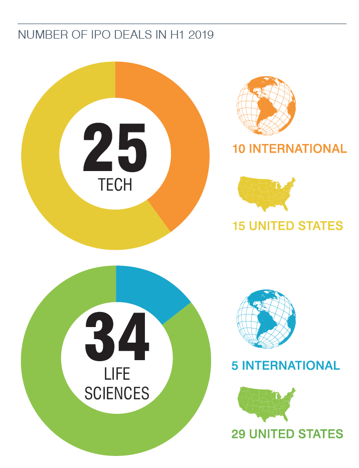
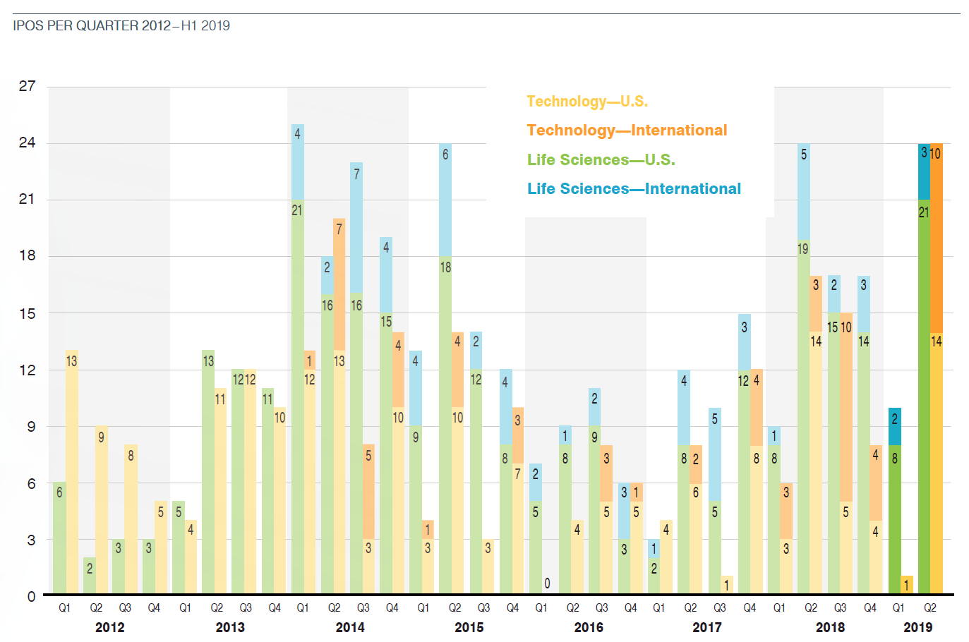
The 59 life sciences and technology offerings completed in the first half of 2019 compared with the 57 in the second half of 2018, continuing a trend of stability. Still recovering from the effects of the federal government shutdown and stock market volatility that slowed capital markets activity in the last few months of 2018, the first quarter of 2019 saw one tech offering (Lyft) and 10 life sciences offerings. The pace picked up significantly in the second quarter, when 24 tech and 24 life sciences companies debuted. In all, 25 tech companies and 34 life sciences companies went public in H1 2019, on par with the 23 tech offerings and 34 life sciences offerings in H2 2018.
The first half of 2019 included 15 offshore companies, compared with 19 in the second half of 2018. In the United States, 20 companies went public in the San Francisco Bay Area—nine of them tech and 11 life sciences—the highest number since we started tracking the numbers in 2014. Also of note, Slack Technologies went public through a direct listing in the first half of 2019, similar to that of Spotify in the first half of the previous year.
Valuations
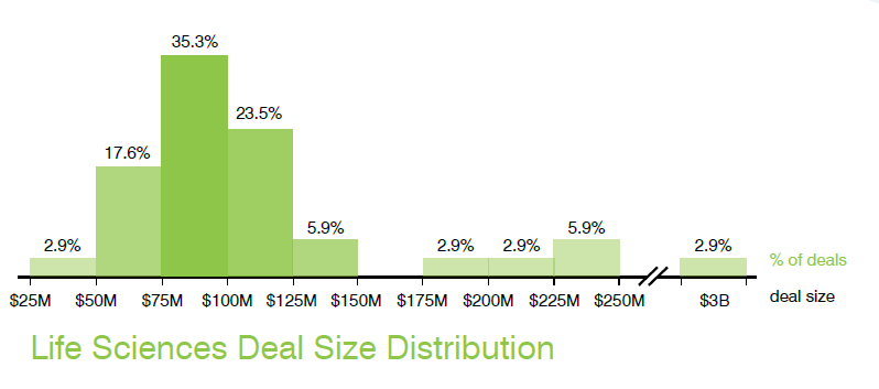
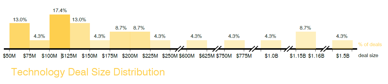
If tech IPOs in the second half of 2018 produced offering proceeds that were marked by an unusually large spread in valuations, H1 2019 did even more so. So far this year, about 12% of tech deals priced between $25 million and $75 million, another 16% between $100 million and $150 million, and another 28% priced between $175 million and $225 million. Life sciences offerings again showed more of a sweet spot in amounts raised: The majority of IPOs in the first half of the year (76.5%) raised between $50 million and $150 million.
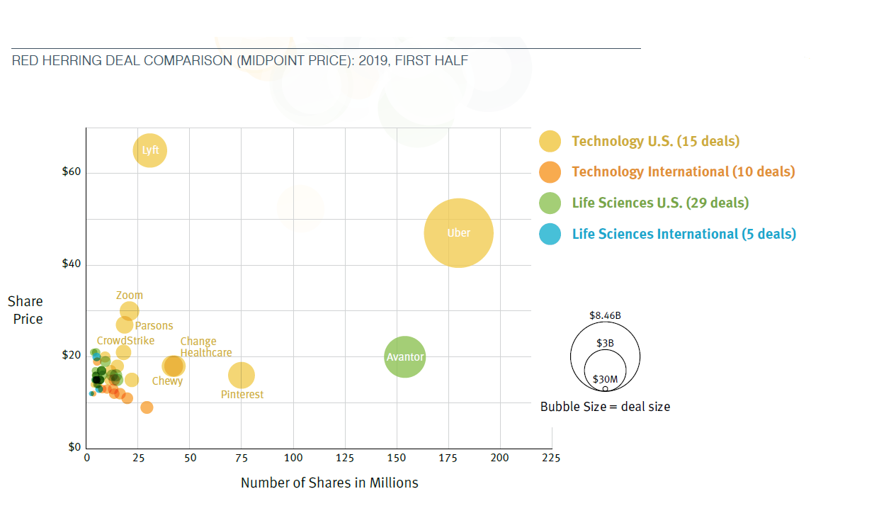
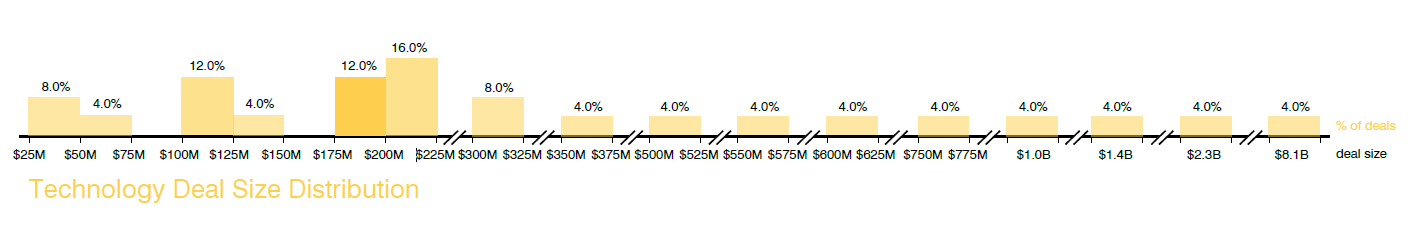
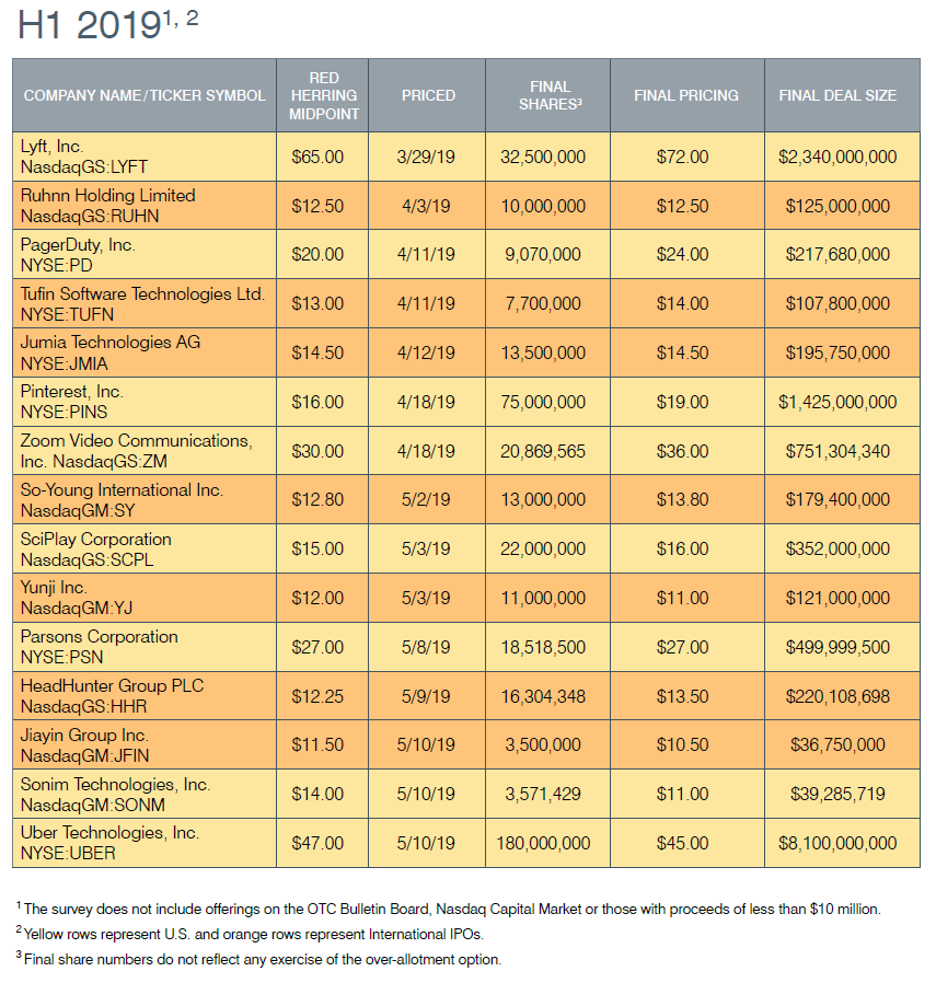
Only five tech and life sciences offerings in the first half of 2019 had proceeds of more than $1 billion. The largest was a technology offering for Uber that raised $8.1 billion. The largest life sciences offering, Avantor, raised $2.9 billion.
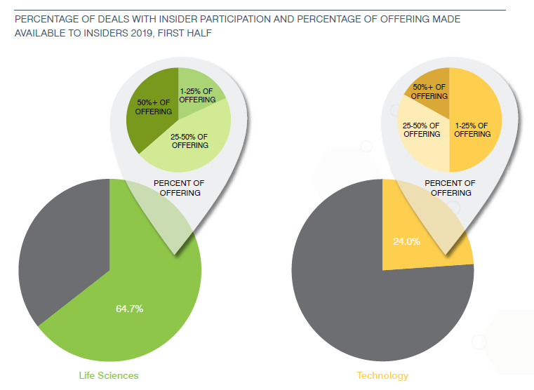
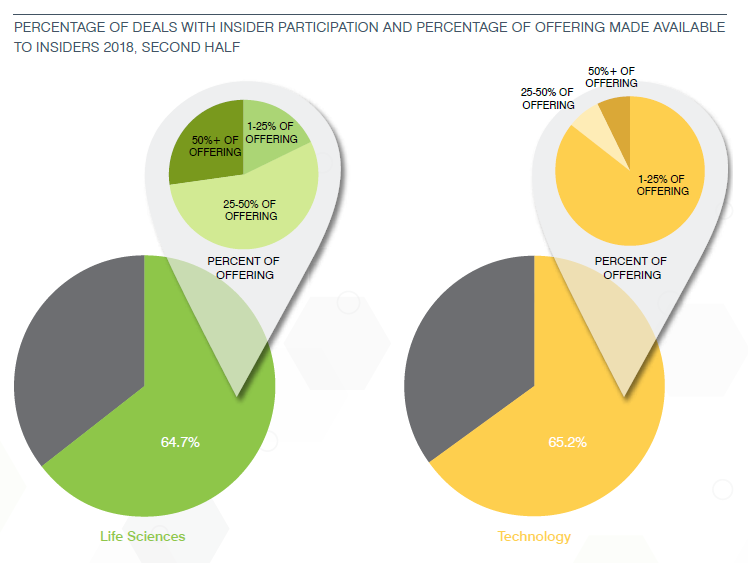
Insider Participation
Tech IPOs reported a more typical percentage of insider participation in the first half of 2019—down to 24% from a one-time peak of 65.2% in the second half of 2018. Approximately 65% of life sciences deals saw insiders purchasing IPO shares and/or purchasing shares in a simultaneous private placement—on par with the first half of 2018.
Dual-Class Share Structure
The dual-class capital structure continued to be widely utilized by technology companies, as 13 technology IPOs featured this structure, the same as in the second half of 2018. Only two life sciences companies had a dual-class structure, compared to one in the prior period.
Pricing
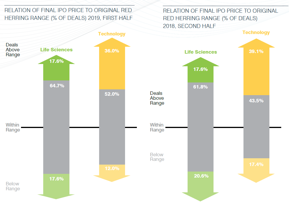
The clear majority of offerings in the first half of 2019 priced within or above-range—88% of tech offerings and 82.3% of life sciences offerings—underscoring a relatively strong and stable market environment. Just three technology offerings and six life sciences offerings priced below the red herring range.
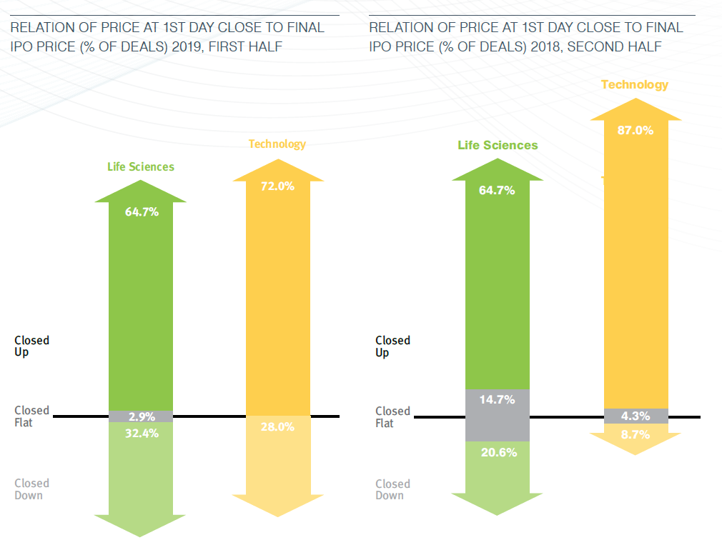
The results indicate that IPOs so far this year were well priced with healthy but modest first-day gains. Consistent with prior half-year periods, technology offerings enjoyed stronger first-day trading as 72% traded up at first day close compared to 64.7% of life sciences offerings.
Outlook
Our H1 2019 data suggests a healthy and stable market continuing, with deals well priced, trending up on average 72% on first-day close for tech and 65% for life sciences. While to date only two companies have done direct listings, more companies are considering this route to becoming public. We anticipate continued strength going into the second half of 2019, notwithstanding the potential for uncertainty surrounding the upcoming U.S. presidential elections and rhetoric around healthcare programs and policies, which may very well affect IPOs planned later this year. It is also unclear how long the bull market for tech and life sciences company IPOs will continue.
This graph shows the number of technology and life sciences IPOs completed during each quarter of 2012 through the first half of 2019.
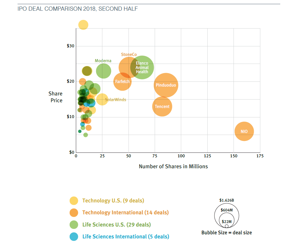
Size of Offerings, Red Herring Midpoint
The following scatter graphs plot technology and life sciences IPOs completed during the first half of 2019 and second half of 2018 in terms of the initial offering price per share and number of shares offered based on the red herring prospectus.

Size of Offerings, Final IPO Price
The following scatter graphs plot technology and life sciences IPOs completed during the first half of 2019 and second half of 2018 in terms of the initial offering price per share and number of shares offered based on actual pricing of the offering.

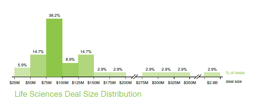
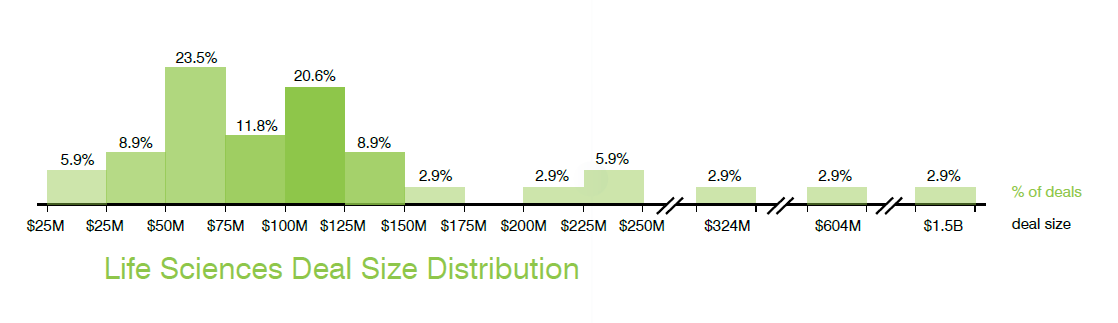
Aggregate Amount Raised, Red Herring Midpoint
The following graphs provide information about aggregate deal size at the red herring stage in the first half of 2019 and second half of 2018.
Distribution of Deal Size (Red Herring Midpoint): 2019, First Half

Distribution of Deal Size (Red Herring Midpoint): 2018, Second Half
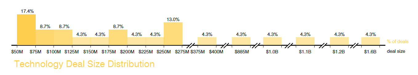
Aggregate Amount Raised, Final IPO Price
The following graphs provide information about aggregate deal size based on the actual pricing of the offering in the first half of 2019 and second half of 2018.
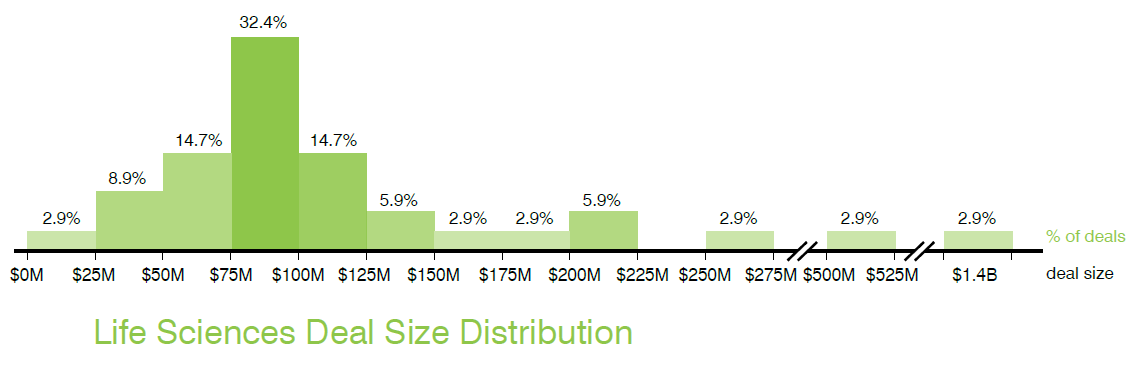
Distribution of Deal Size (Final IPO Price): 2019, First Half
Distribution of Deal Size (Final IPO Price): 2018, Second Half
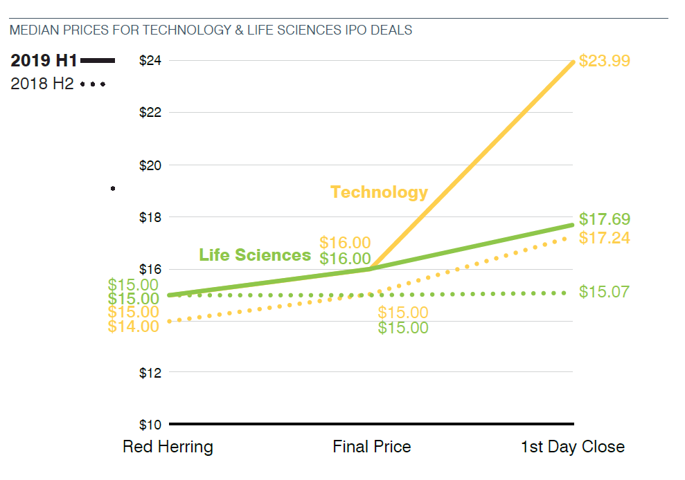
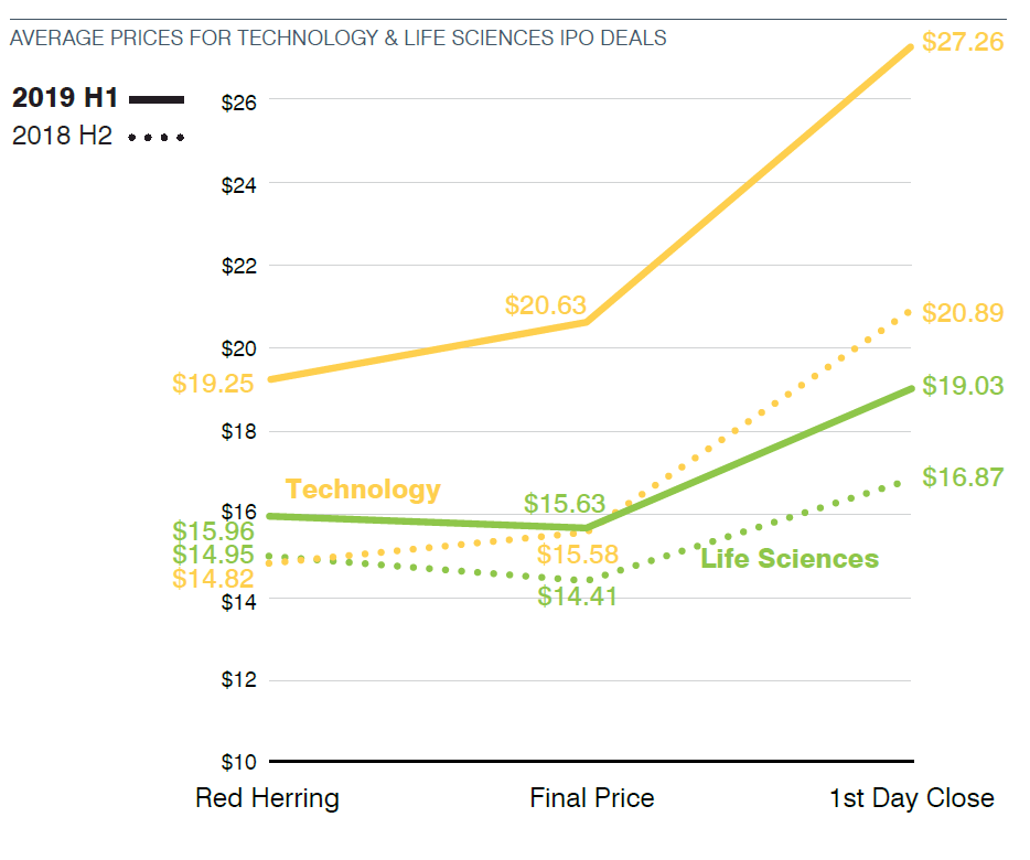
Price Changes Between the Red Herring and Initial Offering Price
Estimating the offering price for the IPO in the red herring prospectus and pricing the IPO upon completion of marketing efforts are processes that are equal parts science and art. These graphs show the median and average prices for technology and life sciences IPOs from the red herring stage to the actual public offering price to the closing price on the first day of trading, for the first half of 2019 and second half of 2018.
Price Changes—Red Herring Range & First Day Trading
The two graphs on the left show the percentage of technology and life sciences IPOs with a final price that falls above, within or below the red herring range in the first half of 2019 and second half of 2018. The two graphs on the right show the percentage of technology and life sciences deals that closed up, down or flat on their first day of trading in the first half of 2019 and second half of 2018.
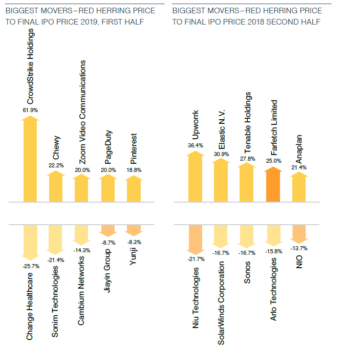
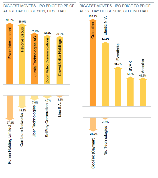
Price Changes—Biggest Tech Movers
The following graphs show the technology company IPOs with the largest percentage gain and loss from the red herring midpoint to the actual initial public offering price and from the initial public offering price to the first day of trading for IPOs completed in the first half of 2019 and second half of 2018.
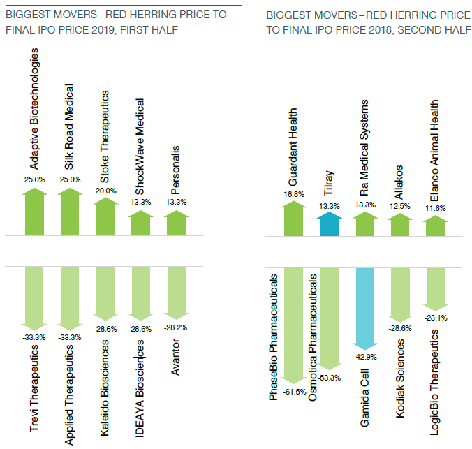
Price Changes—Biggest Life Sciences Movers
The following graphs show the life sciences company IPOs with the largest percentage gain and loss from the red herring midpoint to the actual initial public offering price and from the initial public offering price to the first day of trading for IPOs completed in the first half of 2019 and second half of 2018.


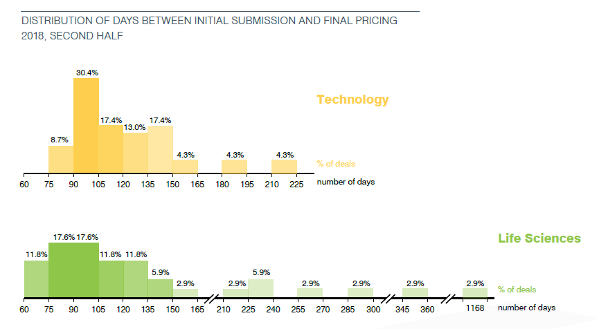
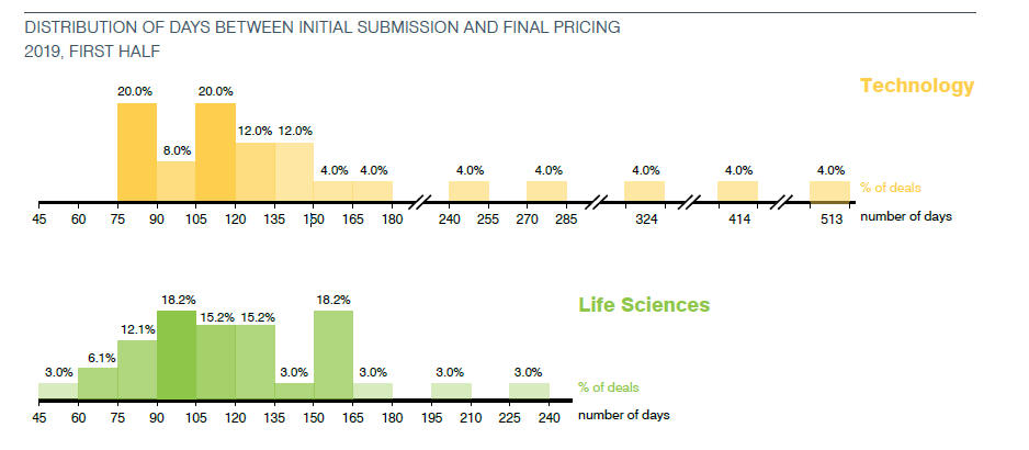
Days on File
These graphs display the percentage of deals that priced within each 15-day period from the initial confidential submission date or, rarely, initial public submission.
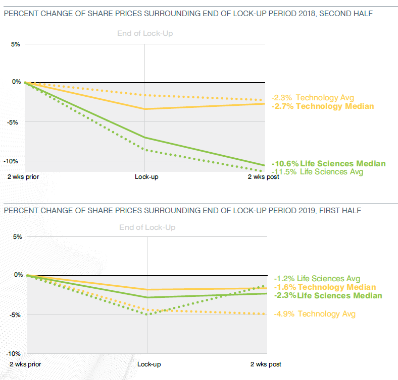
Price Changes Around the Expiration of the Lock-Up
In order to assist the development of an orderly market for the shares being offered, IPO underwriters require the stockholders of the offering company to agree not to sell shares of the company’s common stock for a specified period without the underwriters’ consent. Customarily, this period is 180 days and applies equally to all holders delivering the “lock-up” agreement, although in a few instances the lock-up may roll off in stages, and different holders may be subject to different restrictive periods. Upon expiration of the lock-up period, there generally is an influx of “supply,” as pre-IPO stockholders have their first ability to sell shares into the public market. The graphs on this page show the average and median changes in the closing trading price of the subject company shares for the period beginning two weeks prior, and ending two weeks following, the scheduled expiration of the lock-up period for lock-ups expiring in the second half of 2018 and first half of 2019. Those companies completing IPOs in the first half of 2018 and a follow-on offering within 180 days are excluded from the top graph. Those companies completing IPOs in the second half of 2018 and a follow-on offering within 180 days are excluded from the bottom graph.
Insider Participation
These charts show the percentage of life sciences and technology IPOs in which the final prospectus indicated that specified “insiders” had expressed an interest in purchasing shares in the offering or in a concurrent private placement. Insiders are directors and officers of a company as well as existing stockholders. In this case, insiders are typically existing investors who buy additional shares in the IPO or in a concurrent private placement. Among life sciences IPOs with insider interest, the inset shows the breakdown of shares set aside for insiders.
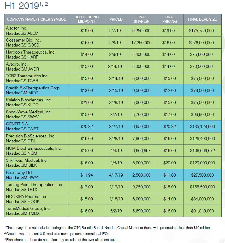
Technology Offerings


Life Sciences Offerings

Methodology
Data points used in the compilation and analysis of this information were gathered using a variety of resources, including, but not limited to, filings made with the U.S. Securities and Exchange Commission, lock-up expiration dates from EDGAR Online IPO Deal Data and daily stock-trading price data. The exact dates upon which lock-ups expired were estimated based on disclosure in the prospectuses and may further be approximate in the case of dates falling on holidays or weekends. Companies were assigned to the Technology and Life Sciences sectors based on SIC codes and other company descriptors.
The information in the graphs and tables regarding offering size does not reflect any exercise of the underwriters’ over-allotment, or green shoe, option. Information at the red herring stage is based on the midpoint of the range and on the number of shares offered, as reflected on the cover page of the first preliminary, or red herring, prospectus. The information regarding the actual offering size is based on the price to the public and the aggregate number of shares offered, as reflected on the cover page of the final prospectus. The closing price on the first day of trading is the closing price on the company’s primary exchange on the first day of public trading of the shares following the pricing of the offering.